Décor Color Palette: Autumn’s in the Air
Over the years I have had clients moving to the Midwest from both coastlines, and I have helped them with the furnishing and decorating of their new Midwestern homes. Ironically, they have had trouble embracing the colors we use here due to the lasting impression of the coastal environments they have left behind. I totally understand that where you live has an effect on how you create the space that surrounds your interior! The great thing here is we experience the change of seasons, and much of our weather makes us feel like we want to wrap up in warmth—hence the warmer colors used in many of our interiors!
With the turning of the leaves in Kansas City, we know what will soon be approaching, and as we grab for those soft cozy throws draped over our sofas, we are happy to have the toasted caramels and rich browns around us to help us feel even warmer just by the nature of our painted walls and furnishings. Winters can be a little longer than we like, so it’s even more important to choose colors that “warm up” your space. Take a peek at these photos… even if winter lasts a while, you’ll feel nice and cozy at home!
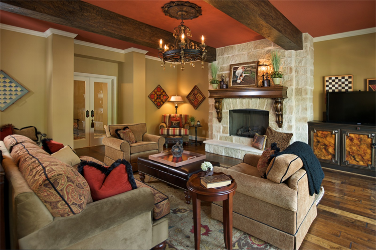
From the orange-red ceiling to the wood floors, everything in this space works for “warm” decor. Red and orange accents blend nicely with neutral tan and brown furniture. The fireplace is also perfect for warming up on a chilly night.
 This room also has the quintessential fall color scheme: deep oranges, yellows and browns. Small accents also contribute to warming up the space.
 How have you incorporated “warmer” décor at home? Or does your home already have the perfect seasonal color scheme? Do share—we’d love to hear from you!
Images: Interior design by The Decorative Touch