2016 Color of the Year – Kansas City Interior Designer
Happy New Year!
We’re celebrating another fantastic year filled with helping our clients and community with interior design to make their spaces more inviting and beautiful.We’re excited to share with you the 2016 Color(s)of the Year and some visual inspirations to incorporate them into your own design whether it be a full room design overhaul or just a few touches to here and there.
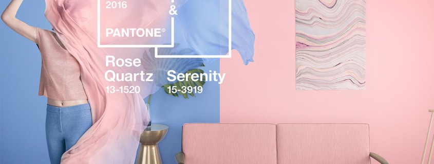
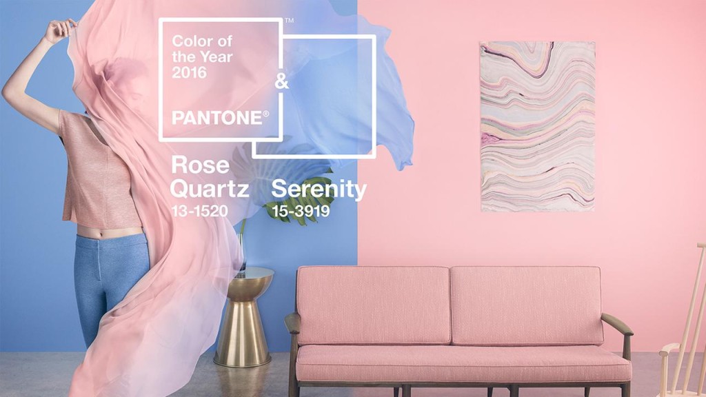
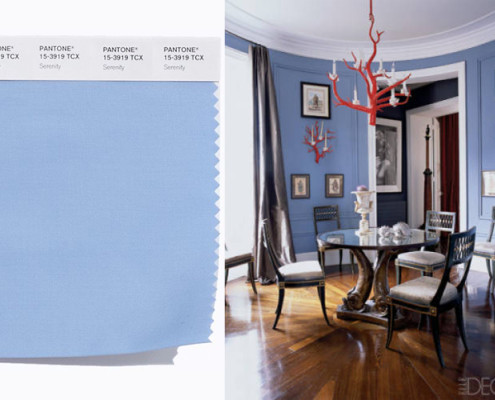
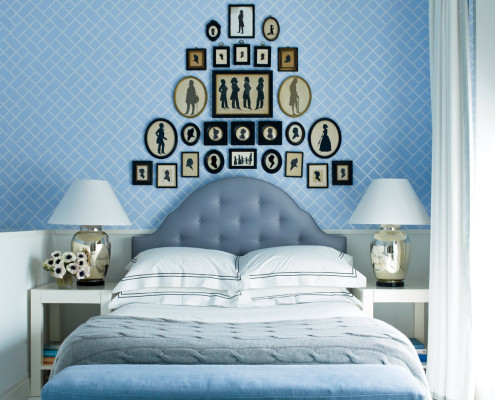
All the buzz has been around Pantone’s Rose Quartz 13-1520 and Serenity 15-3919. That’s right, for the first time they are blending two shades as the official 2016 Pantone Color of the Year. These two colors embrace a balance between the opposing rose tone and the cooler tranquil blue. According to Pantone, the two colors reflect “a connection and wellness as well as a soothing sense of order and peace”. Don’t worry this isn’t the old Wedgewood blue or rose of the 80’s… this has a delicate touch to the tone, and beautiful in a bedroom, nursery, or office. We always enjoy seeing what Pantone has in store for us each year. ENJOY your colorful life!
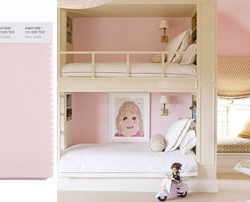
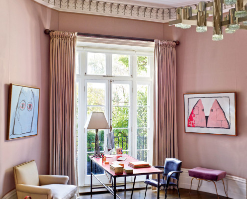
Here are some room inspirations:
- Rose Quartz Bedroom
- Rose Quartz Office
- Serenity Dining Room
- Serenity Bedroom
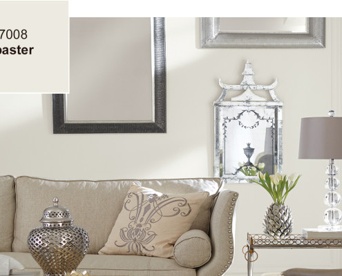
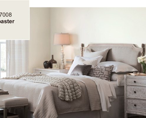
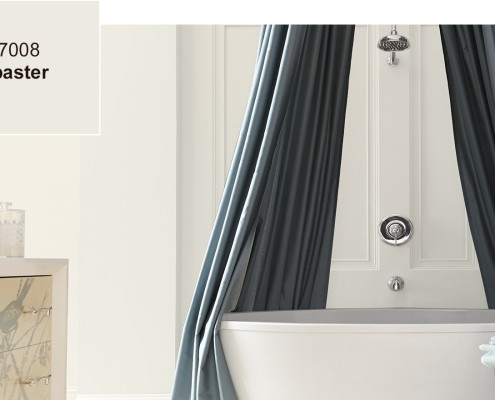
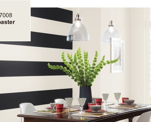
If you aren’t as adventurous to commit to a full room of Pantone’s Color of the Year, Sherwin-Williams has their own take on this year’s tone. According to their website, “a hue symbolic of new beginnings, Alabaster (SW 7008), is Sherwin-Williams 2016 Color of the Year.” This neutral tone evokes its own sense of calm and stability with a “less is more” visual relief.
Here are some ideas on where to use Alabaster in your home:
- Alabaster Living Room
- Alabaster Bedroom
- Alabaster Bathroom
- Alabaster Dining Room
Whether you’re willing try Pantone’s warm opposites are start with the blank slate as offered up by Sherwin-Williams, we can help you navigate landscape.
Call us today for an appointment at: 913-888-1388.

