Color Palette Influences from San Francisco Showhouse
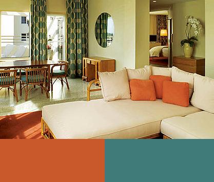
Are you currently considering a new color palette for a room in your home? Well recently came across some images from the San Francisco Decorator Showcase which opened a few weeks ago and we must say it is a very good influence. One of the main things that can be used as an influence are the color palettes featured in the various rooms. Each room includes a mixture of colors ranging from neutral, bright, dark, and earthy. And just as any good design follows they each have their own distinctive style, yet they work together as a whole.
If you are looking for a new color palette for your interiors allow yourself to be influenced by those from the San Francisco Decorator Showcase…


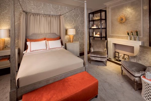
 Josephine Fisher
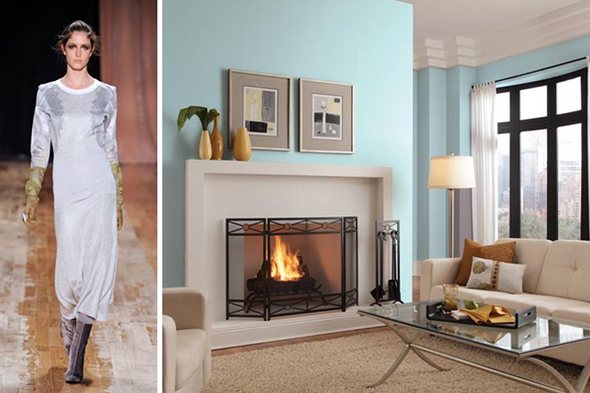
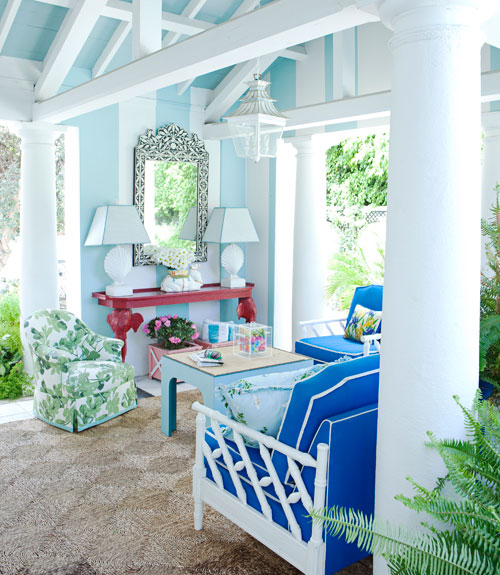
 Kathleen Navarra
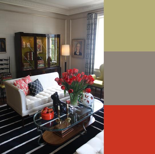
 Matt Murphy
Images from casasugar
If you would like help incorporating any of these color palette ideas into your home call Janine of The Decorative Touch if you are in the Kansas City area.


 Images from