Posts

Tangerine Tango: 2012 Color of the Year

A new year means a new trend. The market leader in color Pantone Inc. says the 2012 color of the year is Tangerine Tango, a strikingly warm hue reminiscent of a sunset glowing in the distance. Tangerine tango dethrones the 2011 color of the year, honeysuckle, and brings interior designers a vivacious reddish orange that can add vigor and warmth to any home.

We couldn’t wait to share how you can you incorporate this friendly, inviting color into your everyday living space, giving off a dynamic energy with a few simple touches. Below are three ways The Decorative Touch suggests you can infuse tangerine tango into your home:

Accent Pieces
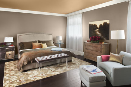
Accent pieces, such a decorative pillows, throws, or even art on your wall can bring in tangerine tango without over saturating the room. Used with other brilliant hues or neutrals such as taupe, the trend can bring in just the pop of reddish orange that you might be hesitant to utilize in other scenarios.

Patterned Fabrics
Include a simple chair or an ottoman with stripes, dots or even piercing paisleys colored tangerine tango to complement the furniture already in the room. Placing a piece designed with delicate touches of tangerine tango in the fabric makes an awesome transformation simple to do.  You can also buy a slip cover for existing pieces in the room.
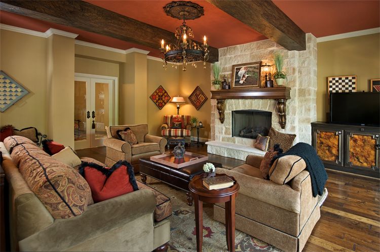
A Coat of Paint

If you are a designing daredevil at heart, try painting the room tangerine tango. Whether painting an accent wall or even the ceiling, a few strokes of paint can go a long way. Not to mention, it’s both time and cost effective.

Image: Interior design by The Decorative Touch

Benjamin Moore Reveals Trendy Colors for 2012

Now that it’s November, are you starting to get curious about next year’s interior design trends? Perhaps the four Color Trend 2012 palettes recently released from paint company Benjamin Moore will help satiate your appetite. As described on the Benjamin Moore website,

“[The company has] searched the world, exploring the latest trends, to bring you a collection of inspired palettes that offer a fresh perspective on your personal style. These four select color groups will bring life to any home and transform the ordinary into the sublime.”

The 2012 palettes include the nature-inspired Earth & Sky palette, the versatile Eclectic Elegance palette, the sophisticated Spiced Life palette, and the classic Sense & Sensibility palette. Visit benjaminmoore.com to see all these palettes come to life in beautifully designed rooms like this one, which Benjamin Moore uses to exemplify the Eclectic Elegance color scheme.

Are you still interested in other big color trends for 2012? Check out our posts on the Sherwin-Williams 2012 color forecast and more of next year’s hottest hues.

Image: benjaminmoore.com

More of Next Year’s Hottest Hues

We recently told you about the Sherwin-Williams 2012 color forecast, but recent color outlooks haven’t stopped there.

The Editor at Large recently reported that the director of Heimtextil and the president of the Color Marketing Group have given people a glimpse at their predicted color trends, which fall into four distinct palettes. The first is Colour Riot, which encompasses bright shades ranging from warm oranges and pinks to cooler blues and greens. Dark Lux is a palette including deep blues, grays and burgundy, and it has a glamorous edge. Then there’s the Craft Industry Palette, featuring rustic neutrals and warmer tones, as well as the Split Clarity Palette, which interestingly was inspired by not only nature, but also technology, The Editor at Large explains.

Colour Riot, Dark Lux, Craft Industry and Split Clarity

Furthermore, global color authority Pantone has just released its Spring 2012 Fashion Color Report coinciding with New York Fashion Week, and we know the trends will appear in the home design industry as well as fashion. The Pantone report also includes multiple palettes: one for women and one for men.

Pantone's women's palette.

Pantone's men's palette.

So, which of these many 2012 palettes are striking your fancy? Do share!

Images: 1-4 via editoratlarge.com; 5-6 via pantone.com

Predicted Color Trends for 2012

It’s only September, but Sherwin-Williams has already come out with its color forecast for next year. Curious which shades will be in vogue in 2012? The Sherwin Williams Director of Color Marketing, Jackie Jordan, had this to say:

“Colors that are analogous, or adjacent on the color wheel, are a dominant trend. We discover a fresh array of combinations within color families—be it fiery reds, watery blues, grassy greens or organic neutrals.”

The colors featured in the Sherwin-Williams colormix™ 2012 forecast are sorted by the color families she mentioned above—neutrals, reds, blues and greens. All four of the palettes relate back to nature.

The neutrals tie in with materials like wood, grain and stones, and the reds relate to fire and fresh flower blooms. The blues have a clear tie-in with water, as do the greens, which also refer to gardens and forests. Visit sherwin-williams.com to see the 10 shades in each color family.

I love attending the color forecast seminar that Sherwin Williams puts on here in Kansas City for the design community. Just like you, we interior designers sit on the edge of our seats and wonder what’s going to be the “hot” new thing for the next season!

Jackie Jordon is amazing; not only does she give us great insight, but her presentations are always inspiring and uplifting, allowing designers to leave her seminars with a feeling of excitement for the new season. It’s kinda like getting to open a new “present” at Christmas for those of us who work with color!  I hope you see something that inspires YOU with the upcoming trends in color — remember, paint is a reasonable way to change the entire mood of a room. Enjoy!

Image via kbbcollective.com