Posts

Pantone Fall 2011 Color Report

Pantone Releases Fall 2011 Color Report

Does it seem as though Pantone just recently released the 2o11 color of the year? Well now they’ve released their Fall 2011 Color Report during New York Fashion Week. Every year a team of fashion designers reveal their color inspirations for the design industry which always end up being the most popular and sought after. This year designers have combined bright colors with staple neutrals. The combination is stated to be reminiscent of the complementing colors artists use in paintings.

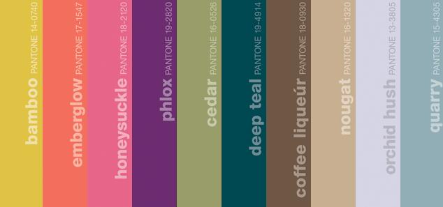
This year’s must have colors for fall include Bamboo, Emberglow, Honeysuckle, Phlox, Cedar, Deep Teal, Nougat, Orchid Hush, and Quarry. And as fashion and interior design so often go hand in hand, these colors will play major roles in interiors throughout the year. While surfing the net for inspiration we came across a few examples of the colors translated into interior design, take a look…

Pantone Fall 2011 Color Report

Want to include colors from Pantone’s Fall 2011 Color Report in your home? Call The Decorative Touch today!

Keeping Up Custom Upholstery

decorativetouch4

Interior design by The Decorative Touch

If you are in the market for a new interior design for any room in your home you may end up with custom upholstery. Using custom upholstery is beneficial because it it specially created for you and your furnishings, and it will be unique to only your home. While custom upholstery is an amazing addition to the design of your room, it’s important to remember it will need special care. If you are investing in well worth, quality upholstery you want to take any and every precaution to preserve and keep it clean. Consider these tips for Keeping up custom upholstery:

  • Choose cautiously. When working with your designer be sure to define your lifestyle so that the fabric chosen is a reflection of it.
  • Avoid the sun. Be sure you keep all your furniture that features custom upholstery away from direct sun to avoid the fabric fading.
  • Fluff and flip. Depending on how much use your cushions endure, vacuum, fluff, flip, and rotate them regularly to even out wear and fading.
  • Clean spills quickly. If an accident occurs on your upholstery clean it quickly by blotting the stain with a clean, white clot. Rubbing may damage the texture of the fabric.
  • Proper placement. Create places for  guests to sit food and drinks on side cocktail tables with coasters
  • Call the professionals. Have professionals give your custom upholstery a deep cleaning once every or two years

Want to include custom upholstery in your home? Call The Decorative Touch today to discuss your design ideas.

Tips adapted from ShelterPop

Turquoise: The Talk of 2010

Just as each New Year invariably brings resolutions, so does it deliver forecasts of home fashion trends. And in terms of color, Pantone—a color research and information center—is arguably the premier predictor; when they talk, anyone who uses color in their profession listens, including interior designers.

Image Courtesy of Pantone

Image Courtesy of Pantone

Leatrice Eiseman, executive director of the Pantone Color Institute, says turquoise is the color of the year for 2010—specifically, PANTONE 15-5519. “In many cultures, turquoise occupies a very special position in the world of color,” she explains. “It is believed to be a protective talisman, a color of deep compassion and healing, and a color of faith and truth, inspired by water and sky. Through years of color word-association studies, we also find that turquoise represents an escape to many—taking them to a tropical paradise that is pleasant and inviting, even if only a fantasy.”

Additionally, the Pantone color experts note that turquoise is a color that most people respond to positively. It’s universally flattering, appeals to both men and women and translates beautifully to interiors. Turquoise adds a splash of excitement to neutrals and browns, complements reds and pinks, creates a classic maritime look with deep blues, livens up all other greens and is especially trend-setting with yellow-greens.

By Louise Lange

Designer Secrets for Help in Selecting the Perfect Paint Color!

1.)  Select your fabrics for the living room or great room first, the rug, drapery, and sofa are often the more expensive items and will generate the color scheme…and the $300-$500 of paint will create the backdrop for these items.  So selecting the perfect shade of “mocha” will often be found in your sofa and help ground the other items in the room.
2.)  Select your tile and granite first if you are working on a kitchen or bathroom, as they are the materials that will remain the longest and again are the most costly.  Its easy to get more excited about your paint color when you can see how well it relates to the materials already selected in the room!
3.)  If you are working on a bedroom, buy your bedding first!  There are so many beautiful bed collections that the paint color can accent so deliciously once your bedding is selected, and your job is so much easier.
4.)  If a bath renovation is on your list, start with wonderful new tile or simply a new shower curtain and your paint or possibly wallpaper can fit in nicely.
5.)  And if you must choose your color palette that flows throughout your home with out all of your furniture selections complete, I do suggest hiring a professional interior designer to help make selections as perfect as possible.  There are many things to be considered when building or renovating…designers do make the processes much easier.