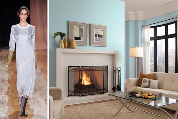
Turquoise: The Talk of 2010
Just as each New Year invariably brings resolutions, so does it deliver forecasts of home fashion trends. And in terms of color, Pantone—a color research and information center—is arguably the premier predictor; when they talk, anyone who uses color in their profession listens, including interior designers.
Leatrice Eiseman, executive director of the Pantone Color Institute, says turquoise is the color of the year for 2010—specifically, PANTONE 15-5519. “In many cultures, turquoise occupies a very special position in the world of color,” she explains. “It is believed to be a protective talisman, a color of deep compassion and healing, and a color of faith and truth, inspired by water and sky. Through years of color word-association studies, we also find that turquoise represents an escape to many—taking them to a tropical paradise that is pleasant and inviting, even if only a fantasy.”
Additionally, the Pantone color experts note that turquoise is a color that most people respond to positively. It’s universally flattering, appeals to both men and women and translates beautifully to interiors. Turquoise adds a splash of excitement to neutrals and browns, complements reds and pinks, creates a classic maritime look with deep blues, livens up all other greens and is especially trend-setting with yellow-greens.
By Louise Lange


