Major News from the Color Authority Pantone
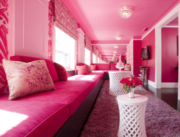
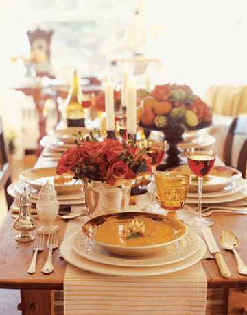
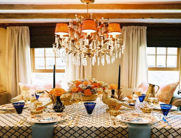
Today designers everywhere are sifting through millions of new design and color palette ideas. Wondering why their creative wheels turning? Because Pantone released their color of the year last week. The color authority chose PANTONE 18-2120 Honeysuckle as the 2011 Color of the Year. The reddish-pink hue replaces the much loved and widely used 2010 Color of the Year, PANTONE 15-5519 Turquoise.
Honeysuckle can be described as vibrant, courageous and confident. Directors at Pantone’s color institute believe the bold color is uplifting and encouraging.
In times of stress, we need something to lift our spirits. Honeysuckle is a captivating, stimulating color that gets the adrenaline going – perfect to ward off the blues,” explains Leatrice Eiseman, executive director of the Pantone Color Institute®. “Honeysuckle derives its positive qualities from a powerful bond to its mother color red, the most physical, viscerally alive hue in the spectrum.
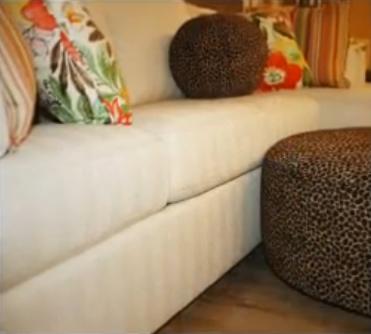
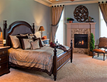
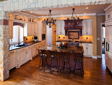
We are already envisioning rooms being lit with large doses or small pops of the lively color. What do you think about Honeysuckle, would you mind adding into the interior design of your home?


 Images from houzz and Elle Decor
Call The Decorative Touch at 913-219-7333 to begin planning how to use Honeysuckle into the decor of your home!


 As the owner of Rockwood Builders I have known and worked with Janine for 12 years. She does all my selections after I’ve completed a project. She has carte blanche when picking paint colors, carpet, tiles, light fixtures as well as exterior colors. When it is time for us to furnish a model home Janine also does all the staging of the house. Each and every experience I’ve had with Janine has been a complete pleasure. Not only is she easy to work with, she has the personality to go with it.


